Better display design improves the customer experience because it removes uncertainty. When fixtures, counters, and display cases are organised around how people actually move and decide, a shopper understands the offer faster, compares products with less effort, and asks for help at the right moment instead of leaving.
Decide what the customer sees in the first three seconds
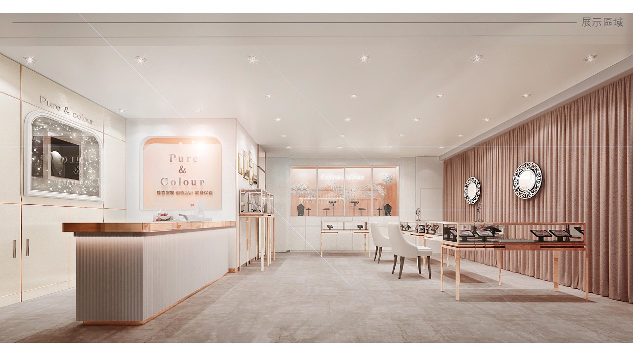
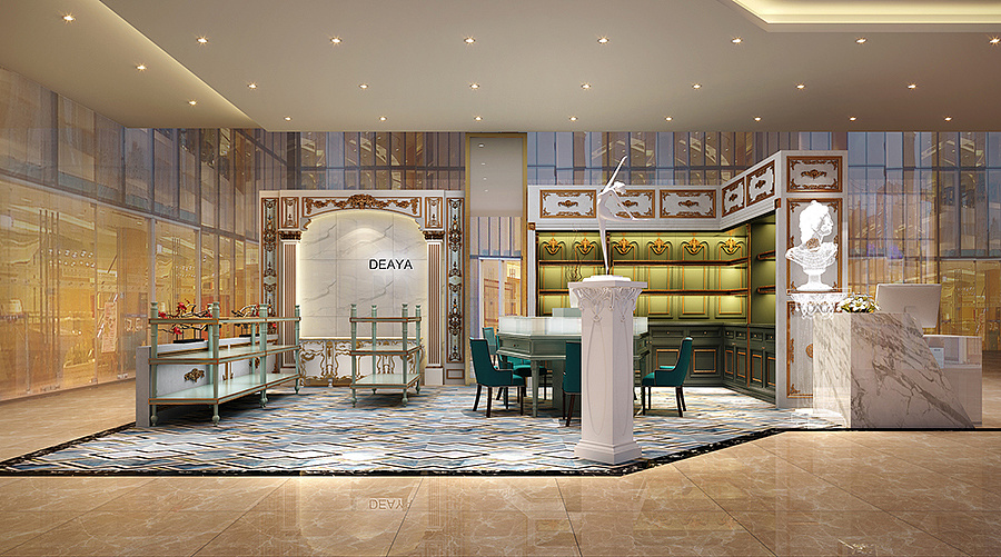
The entrance sightline does more work than any other part of a store. From the threshold a customer should be able to read three things without moving: what the store sells, where to go next, and where to find a person if they need one. If any of those are hidden, the customer hesitates, and hesitation at the entrance is where visits end.
In fixture terms this is a height decision. Tall fixtures placed near the entrance block the view into the store and make the space feel smaller than it is. Keeping mid-floor fixtures low in the first stretch of the store, and pushing full-height units to the perimeter walls, opens the view to the back wall and the service point.
The back wall is the second half of the same decision. It is the surface every customer sees, so it should carry the strongest category or the clearest brand statement, not stock overflow. A well-lit feature wall at the back pulls customers through the whole floor. A cluttered one stops them at the front third.
- Low mid-floor fixtures in the entrance zone, tall units against the walls
- One strong back wall, lit deliberately, not used for overflow stock
- Service counter visible from the door and distinguished by finish or light
Build a hierarchy the customer can read
Hierarchy is the difference between a store that feels curated and one that feels like a warehouse. Hero products need stronger visibility, secondary products need logical support, and everything else needs to be findable without dominating the view. When every product is presented with equal emphasis, customers cannot tell what is worth their attention and tend to default to the cheapest item or to nothing at all.
Fixtures create hierarchy through three levers: height, density, and light. A product presented alone at eye level on a lit shelf reads as important. The same product in a dense run at knee height reads as a commodity. Neither is wrong, but the choice should be deliberate and should match what you are actually trying to sell.
Density is the lever most often over-used. Adding facings increases what is on display and decreases what is noticed. In premium and consultation-led categories, deliberately leaving space around a hero product does more for its perceived value than any finish upgrade. A glass display case works on exactly this principle: it holds fewer items than an open shelf and makes each of them read as more considered.
Let customers touch the right things
Most purchase decisions in physical retail involve handling the product. Display design decides what can be picked up, what can only be seen, and how the customer knows the difference without asking. Getting this wrong produces two failures: customers who will not touch anything because the display looks too precious, and shrinkage on items that should have been secured.
Tester and sampling systems are the clearest example. In beauty and personal care, a customer who cannot try a shade will usually not buy it. A beauty tester wall display system resolves this by separating the tester from the stock: the tester is out, visible, and replaceable, while the sellable unit sits below or behind. The same logic applies to fragrance, where the tester needs to be reachable and the boxed stock does not.
For high-value items the equivalent decision is access control. A locking case keeps the product visible while making staff involvement part of the process, which is a genuine experience improvement in consultation categories rather than a barrier. The failure case is a locked cabinet with no staff nearby, which reads as an obstacle.
- Separate testers from sellable stock so neither compromises the other
- Place testers at a height a customer can use standing, with space to set a bag down
- Keep locked cases within sight of a staff position
- Make the open-versus-secured rule obvious from the aisle, not item by item
Design the service counter around the conversation
The counter is where the experience is most often lost. It is the point where a customer waits, pays, asks questions, and forms their last impression of the visit, and it is usually specified last with whatever budget remains.
The first decision is whether the counter is a barrier or a shared surface. A transaction counter screens the work behind it and keeps the customer on one side. A consultation counter is lower, more open, and lets staff and customer look at the same thing together. Stores that sell through advice need the second type and frequently install the first.
In food and beverage formats the counter also has to handle the order, the preparation, and the hand-off, which are three different customer moments happening in one metre of frontage. A custom service counter is usually planned so the ordering position, the equipment, and the pick-up point do not collide, because a customer waiting for a drink standing in the ordering position stops the next order from being taken. The cafe counter category covers how those zones are separated.
Make it work for staff, or it stops working for customers
Good display design supports the staff side of retail as much as the customer side. Easier replenishment, better storage access, and clear presentation zones make conversations smoother and remove the friction customers feel when a store is under pressure. A display that cannot be refilled quickly will be left half-empty during the busiest hours, which is exactly when it matters most.
Ask a practical question about every fixture before it is produced: how long does it take one person to refill it? If a shelf requires unloading the whole run to reach the back, or a case has to be unlocked from an awkward angle, it will be maintained badly. Pull-out drawers, accessible case backs, and stock kept close to the fixture it serves all reduce that cost.
The BAG TO YOU store project shows how a fixture family is resolved so that display, stock access, and daily operation share the same system instead of competing with it.
Where to start
When display design is treated as part of the retail strategy rather than as decoration, it shapes dwell time, trust, product discovery, and what a customer remembers about the visit. But it only changes those things through specific, buildable decisions: fixture heights at the entrance, the hierarchy rule, the open-versus-secured line, the counter type, and the replenishment method.
If you are planning a new store or improving an existing one, the fastest way to make progress is to walk it once as a customer would and note every point where you hesitate. Then send the floor plan, the category list, and those notes through the contact page. The beauty supply store fixture and store design service pages cover how a full fixture package is developed from that starting point.